20/02/2026 | Design


We all do it.
Take one look at a logo and make assumptions about the brand behind it.
Whether consciously or not, we use branding to build up a picture of what a business does and how well they do it. And logos are central to this.
Your logo defines and represents who you are as a business. A good logo turns heads, makes a strong first impression and grows awareness of your brand. But a bad logo can leave you looking bland, dated or unprofessional.
Every business has a strong logo concept in them. They just need to set aside some time and money to do it properly. Read on for the 2025 dos and don’ts of creating an effective logo design – with real-world examples from Yorkshire SMEs.
Don’t go for the cheapest option
We know budgets have limitations – but your brand identity deserves to be factored in. Your logo and branding are the building blocks of your marketing activity. Without a strong visual identity, you are underselling yourself across all channels.
Go for the cheapest logo option and you limit your potential and risk spending more money down the line. Cutting corners can leave your business looking cheap and dampen your perceived value to the outside world.
What is the real cost of a cheap logo?
- Looking unprofessional and less trustworthy.
- Missing the chance for a strong first impression.
- Losing customers to competitors with more appealing branding.
- Selling your products and services short with a low-quality design.
- Confusing your target customers and not appealing to the right market.
- Putting people off – customers, partners, investors, new recruits.
- AI-generated and lookalike logos risk confusion and legal headaches.
- Trendy logo generator brandmarks date fast and fall out of fashion.
- Unresponsive logos and weak branding wastes time and marketing budget.
- You risk spending more money on a rebrand down the line.
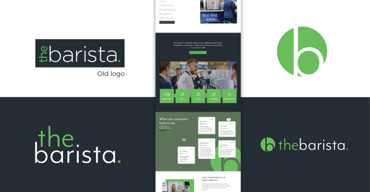
The Barista logo before and after:
Don’t use AI or a logo generator
Your logo should be unique. It might seem like the easy option, but logo generators produce generic, trend‑led marks that date quickly and often clash with licensing. AI-tools give similar outputs that could have been served up to thousands of other businesses.
Falling into the trap of using a free online logo generator leaves you with a weak, generic, off-the-shelf logo. This not only looks less impactful, but you run the risk of hundreds of other companies and competitors ending up with a very similar logo.
Don’t overcomplicate it
A logo should be instantly recognisable and making sure it’s clear and simple is the best way to achieve this. A complicated or artistic design might look great, but it might not deliver the same instantaneous visual impact.
Logos are often seen in small sizes, in a webpage header, email footer, on a business card or name badge. Something with too much detail or wording becomes illegible. Choose a simple, eye-catching design that’s more likely to resonate with people and be better remembered.
If your company has a long or formal name, consider using a lettermark or monogram logo. This is straightforward and easily recognisable, while still allowing you the creative freedom to play around with font, colour and style to make it unique.
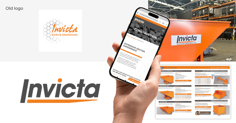
Invicta logo before and after:
Don’t forget to check the name
If you are creating a brand, don’t launch a new name blind – do the basics first. Search Companies House, the UK IPO trademark register and Google to see who’s already using it. Check domains and social handles, including close misspellings.
Say it out loud – is it a mouthful to say or does it sound like something awkward? Sense‑check meanings in other languages, slang and regional colloquialisms, and look for unfortunate initials or acronyms.
Once you’ve settled on a name and logo, lock it down. You might want to register the trademark, buy the main domain plus sensible variants and secure key social handles. Set up simple monitoring – Google Alerts or trademark watch – so you spot conflicts early.
Logo design mistakes to avoid:
- Not checking trademarks or name translations.
- Not using a professional designer to create it.
- Picking a trendy look that dates fast and doesn’t fit.
- Using AI or a logo generator for the final design.
- Using a busy icon that becomes illegible when small.
- Not using scalable vector graphics to ensure large scale print doesn’t look pixellated.
- One size, unresponsive logo that doesn’t work for all contexts.
- Copying the competition and inviting complaints.
- Ignoring your mission and values in place of something generic.
- Choosing hard to read type or colourways.
Do your research
We often see business owners and leaders get distracted by personal preference or the opinions of others. But your logo needs to represent your company, appeal to customers, and be suited to the industry your business operates within.
Within a brand identity project, a designer looks at your overall business objectives, marketing strategy, target audience, competitors and market research. They explore your company mission, values, history, origins and what makes you different.
All this information gives an understanding of what’s needed for your logo. It influences the creative direction, references and reasoning behind your logo design. It’s this research and creative exploration that results in a truly unique design that’s authentic to your mission.
Choosing a logo that reflects your company mission:
- Don’t let personal taste lead – prioritise your customers’ needs.
- Your logo must fit your company, customers and industry.
- Start with business goals and your marketing strategy.
- Review competitors and market to find clear, ownable space.
- Explore mission, values, history and what makes you different.
- Gather authentic viewpoints and experiences from your people.
- Turn ideas into a focused creative direction and use references.
- Test ideas against real use‑cases and customer expectations.
- Research plus exploration produce a unique, authentic logo.
- Aim for a logo that represents your impact, not just abilities.
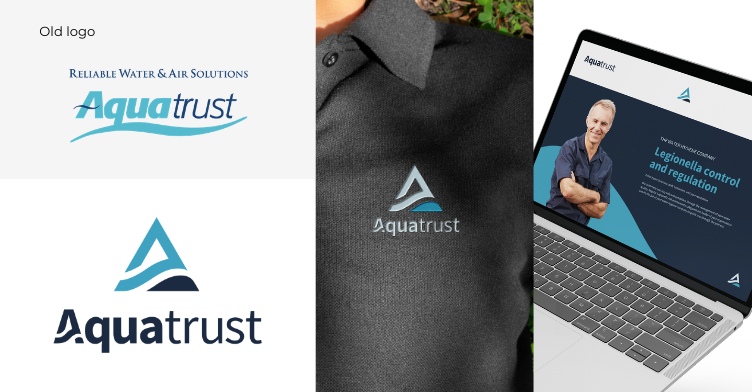
Aquatrust logo before and after:
Explore lots of examples
Looking to other brands helps you build up a picture of the look and feel you’d like to go for. Do some of your own research: shortlist examples of the logo styles that work and make a list of the brands that conflict with your brand identity to rule out the styles to avoid.
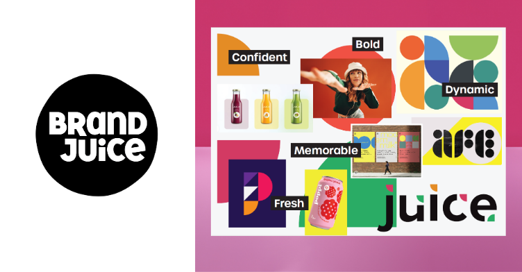
Brand Juice creative exploration:
Do make your logo responsive and accessible
Your logo will appear in hundreds of places, both digitally and physically, and the design must plan for these different contexts. For instance, a rectangular logo may look great on a sign or letterhead, but how will it fit in a square profile image on social media?
An effective logo design is dynamic and adaptable, with elements that change form and scale to suit a variety of different contexts features. You will end up with a pack of different logos – all recognisable as one brand – but perfectly designed to suit each context.
Another consideration is accessibility. Is your logo readable for low‑vision users or screen reading technology? Is it clear and consistent? It’s the responsibility of a business to make sure their brand, website and marketing activities are accessible to all users.
The importance of a responsive logo design for business growth:
- Your logo stays clear and readable in small spaces.
- It works for a multitude of different contexts.
- People recognise your brand faster across websites, apps and signs.
- You spend less time fixing odd crops or blurry files.
- New sites, vans and uniforms look professional and consistent.
- It looks good on light and dark backgrounds.
- Colours and contrast work for more people, including low‑vision users.
- Ads and posts look consistent, so you look more professional.
- You’re ready for new platforms without another redesign.
- Sales documents and bids look professional with a logo tailored perfectly to that context.
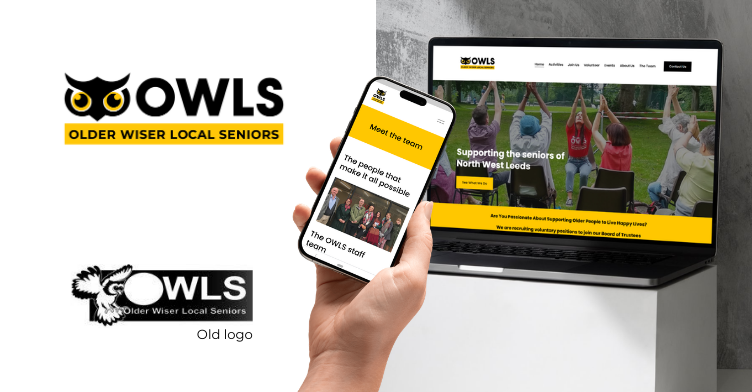
Owls logo before and after:
Do ask the perspective of others – in the early stages
What you think represents your brand may not look the same to an outsider who doesn’t know your business. Logos are visual and everybody interprets them in a slightly different way, so it can be useful to test out your logo design to eliminate points of confusion.
Equally, your logo must feel authentic to the people behind your brand – your employees, customers and partners. These people have lived experience of your business and understand what makes it tick. Gathering their perspectives can be a useful exercise during the research stages of a brand project as it fleshes out your positioning.
The people you ask may even pick up on something you didn’t think about initially, which could be fundamental to reaching the final design.
Do hire a designer
It sounds obvious, but there are so many businesses that think they can save money by managing without a trained graphic designer for their brand identity creation.
But an effective logo is the foundation of a strong, recognisable brand. Its value shouldn’t be underestimated. Give your logo the time and budget it deserves by commissioning a professional to design it. This way, you’ll end up with something original that truly reflects your business – and stands the test of time.
Remember – a logo is not a brand!
Your logo is a core part of your branding, but the other components are just as important. The colours, fonts, graphics, imagery, tone of voice, and brand values all contribute to how your business is perceived. They work together in harmony to build up a clear picture.
Your logo design is one part of the puzzle, and it needs to be designed in conjunction with your wider brand strategy. This is what is going to create a distinct, compelling brand story that attracts the right type of customers and gives you the competitive edge.
Got any questions or looking for branding or graphic design advice? Contact us on 0113 394 4559 or hello@yourengineroom.com.