15/06/2022 | DesignDigital

What we learned about designing for the elderly
More and more of our daily tasks and pursuits take place online. We have online banking, shopping, music, TV streaming, zooming friends, booking travel and accessing health services. Most of us relish the ease and speed that comes with getting things done online.
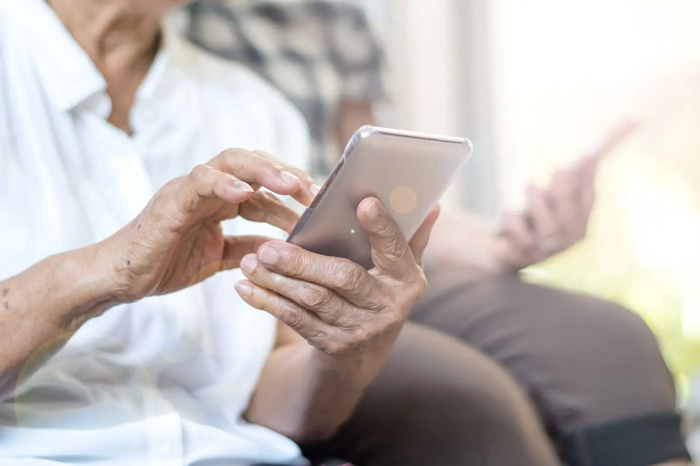
But for others, the thought of completing tasks online brings stress and frustration. Unfamiliarity and difficulty reading text online make simple tasks difficult or inaccessible. For older people who have adjusted to the internet in later life and may have fading eyesight, it can be a problem.
“Digital content, websites, services, and technology are increasingly important to stay engaged and connected in today’s world.
“As the number of older people increases, particularly in developed countries like the UK, it becomes more important to design websites and other digital services inclusively so that it meets their needs.”
The Alzheimer’s Society
Designing for an elderly charity
We learnt more about this when we undertook a web build project for a local charity. OWLS (older wiser local seniors) is a charity that works to reduce loneliness and social isolation for seniors within a small area of Leeds, helping them stay healthy and independent, and enjoy life to the fullest.
Activities and events are listed on the website and the charity uses it to recruit new members and supporters. The new website needed to be clearly browsable for the visually impaired and non-regular internet users.
We wanted to conduct some research before we set about creating the theme. The old website needed a complete overhaul and we had to tackle the user-friendliness of the design. We wanted to be certain about what to use and what to avoid from an accessible design perspective.
Here’s what we learned:
Colour
Strong colours in high contrast are needed for fading eyesight as lots of colours begin to look similar as you age. Eyesight takes on a yellow tinge and our eyes are less able to make out low contrast.
The OWLS brand colours are bright yellow and black, chosen with visibility in mind. We ran with these brand colours, using them across the website for text, section blocks, footers, and call to action buttons. The result is a cohesive and more readable website design.

Text
For clarity, use bold, black text on a white background. Fonts should be clear and crisp, avoiding decorative lettering and special characters.
We used plenty of white space and white backgrounds for the bulk of the copy on the OWLS website. We chose Poppins for the font. The clear, rounded letters are readable and clear when made bold. Any white text sits on a high contrast colour background.

Layout
Website designs for the elderly should be kept simple, free from distractions and unnecessary content. Presenting people with too many journeys can confuse things.
The OWLS layout has a sticky top navigation bar for access. The simple text and image block layout is easy to browse on mobile, desktop and tablet. We used clear headings, such as ‘Our activities’ and ‘Volunteer with us’ to make the purpose of each page apparent.
Calls to action
Large buttons with high contrasting colours are best for fading eyesight. Keeping navigation buttons consistent in design makes it obvious where to click and go next. Where possible, maximise clickable areas, leaving plenty of space between objects on the page.
The call to action buttons were a big consideration for the OWLS website. The goal of the project was to increase memberships, volunteers, and activity participation, largely through digital sign up. The website design needed to make it obvious where and how to do this.
We designed a contact us page with general details, plus a sign-up form in black and white text. The form doesn’t feature too many required fields, to limit drop-off. We used large buttons in either yellow or black for visibility on every page. Buttons are labelled with instructive text, for instance, ‘Volunteer today’ and ‘Find out more here’ rather than general terms such as ‘more’ or ‘join’.

Images
When designing for any demographic, images help to visually support messages and make information more readily accessible.
The imagery we used for the OWLS website was, for the most part, real photography collected by OWLS employees and volunteers. OWLS is a local charity, and it was important to us that visitors to the website recognised the charity’s members and local area within the photography.
We used images are to illustrate the text. The events calendar is a good example of where we paired photography and graphics with the detail of the text to make the activity apparent to the user.
Supporting OWLS to reach new members
Along with the website redesign, we ran a month-long social media campaign to launch the new site and target new member sign-ups within the specific area.
The audience for this campaign was small – OWLS wanted to reach people aged 50+ living within 5 postcodes. We located the relevant campaign audiences on Facebook and LinkedIn.
Results over one month:
- 2,321 website page views.
- 972 users on the website.
- 120% increase of users to the website.
- 62.70% of visits from search and social channels.
- 28 people contacted OWLS through the website.
The campaign succeeded in reaching hundreds of new people, leading to new members and supporters. The charity was so pleased with the new brand and website, they referred us to their partner organisation, Bramley Elderly Action (BEA).
We redesigned the new BEA brand and website in line with the OWLS redesign, using a similar layout and relying on accessible design choices. We delivered training to both the OWLS and BEA teams, showing them how to use the website and add and edit content.
Both websites have seen great responses. They are clear and informative, with good loading speeds and simple navigation. Text is kept minimal, and images support the main messages. Lee Ingham, General Manager at OWLS Leeds, had this to say about the project:
“We now have a website that we can be proud of. It’s easy to use and provides the necessary information without being cluttered. The team at Your Engine Room were open with us and have a genuine interest in what we deliver.”
How is your website performing? If you think yours could be improved or perform better, why not request our free marketing audit? Just leave us your details via our website and we’ll send you your results within 48 hours.